Sunday YouTube Videos
This weeks Sunday YouTube Videos is dedicated to light & color. Both are always around, surrounding us, effecting the way we think and act. May favorite part of teaching lighting has to be color theory and how we perceive color. It plays an enormous role in what we do in theatre. Here are a couple of videos that help explain how light and color are not just the same, but how we react to them. I LOVE the last one!
Greatest Stage on Earth: Color and Emotion
Color. Nothing affects our mood and emotional response more. It can make us angry that Brutus just betrayed Caesar, dream that Juliet is just beyond our reach, and swoon as Cinderella dances the night away with her prince. Color is an amazing tool that when applied properly strengthens and carries the emotion of the subject you’re lighting.
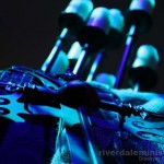 Warm colors can be an indication of spring and summer, happier times, or high energy. Cool colors can represent deep emotional thought, winter, nighttime, or flashbacks. When selecting colors for use in the HOW market, one of the most important things to learn is how they affect emotion and the human mind. Below is a breakdown of the specific areas of our emotional spectrum that color can affect.
Red – Fire, Anger, Blood, Violence, Death, War. Perhaps one of the strongest and most perceived colors on the human eye, red is often representative of violence. It will increase an audience’s heart rate and respiration. Red is also associated with courage and bravery. Red is also the most noticed color.
 Orange – Joy, Sunrise, Happiness, Enthusiasm, Creativity, Health. The eye picks up orange as a very warm color, not as hot as red, but more active than yellow. It can increase oxygen flow to the brain and stimulate mental activity. As the color of fruit, orange is associated with health and vitality. When used with food displays it can make the items appear more appetizing.
Yellow – Sunshine, Joy, Intellect, Energy, Happiness. Yellow warms us. It is seen as light. Strongly associated with electricity and energy. Pure yellow focuses our attention. However, when overused, yellow can become disturbing. When used against black, yellow will be recognized before other colors. This is why it’s used for safety warnings. Yellow also can contradict itself, representing both honor and loyalty as well as cowardice.
Green – Nature, Growth, Harmony, Freshness. Green is the most restful color for the eye. It can stimulate healing in patients. Green is associated with fresh food and nature. Green can also indicate a lack of experience. Dark shades can be associated with money and jealously. Yellow-green shows illness and discord. Aqua shows healing and protection. Olive is associated with peace.
 Blue – Sky, Ocean, Water, Stability, Trust. Most often associated with tranquility and peace. Blue represents both the sky and water. It calms the mind and slows down metabolism. A masculine color, blue represents power, integrity, seriousness and focus. Blue is very effective at calming an audience. It can also be very striking against a palette of warm colors.
Purple – Royalty, Power, Nobility, Luxury, Wealth, Decadence. Traditionally associated with Kings and Queens. Purple denotes wealth and luxury. It also is indicative of mystery and magic. It is the most preferred color of children. Rare in nature, purple can often be considered artificial. It is the most feminine color.
White – Light, Good, Innocence, Purity, Faith, God. White is considered to be the color of perfection. It evokes safety and faith. It is a positive and strong emotional color. The color of snow, white is pure and clean. As such it is often associated with doctors, nurses and hospitals. Biblical figures are often depicted in white clothes. However, use white carefully as too much can overload the emotional center of the mind.
 Black – Elegance, Death, Evil, Mystery. Black is the most negative of colors. Arguably the absence of color, black is often associated with death and evil. Shadow can accent and heighten the color around it. Black makes things appear longer and thinner. Black when used as the color of objects, denotes strength and authority.
An inescapable part of everyday life, color is all around us. Using it to your advantage is one of the best skills that you as a lighting designer can develop. Get out there and discover what works best for your subject and hone your skills today.
More information about color and color theory can be found here.
Tuesday Twitter Trivia – CMY vs RGB
 Tuesday is here once again and that means we are one day closer to the weekend. To help expand our minds and use the knowledge that we learn yesterday with RBG vs CMY values, this weeks Tuesday Twitter Trivia questions puts that knowledge into practice.
What is the “theoretical” CMY values for Pink with RGB values of 100%, 25%, 70%?
Know the answer? Send your response via an @ reply to @iSquint through twitter. The first person in with the correct response wins an iSquint prize pack. The winner will be announced tomorrow.
If you have a Tuesday Twitter Trivia question that you think will stump everyone, I would love to hear it. Send your trivia questions via the Contact Us page here on iSquint. You might just win a prize pack yourself!
RGB vs CMY Color Values
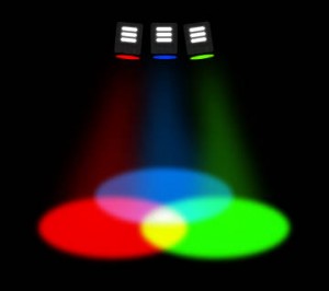 We all understand color theory and mixing thus far in our career. With a huge thanks to Lucas Krech and his color theory essays, we can say we have an even deeper love and respect for color. One thing I was recently turned on to was the conversion from RGB values to CMY values within lighting.
Miles Dudgen from Prism Projection made me aware of how we can take an RGB value and quickly turn it into a CMY value.
“Pure” theoretical RGB and CMY are the inverse if each other. Of course this isn’t really true, because the starting RGB points and starting CMY points won’t be the true inverse of each other. If CMY systems were pure, a Sea Changer at 100%,100%,100% would be blacked out. Its close but not black. And pure RGB systems would be white at all full (we all know how that works out).
To help illustrate Miles point, lets take a look at what some of the colors look like when mixing between RGB and CMY.
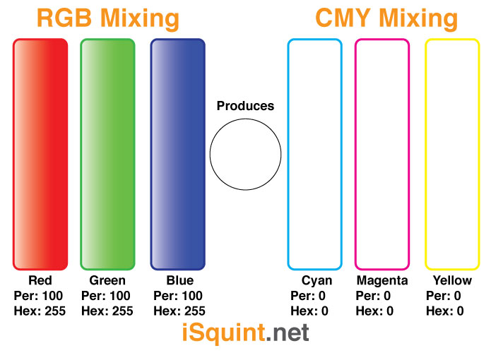
In the above illustration, it show what colors DMX value per each mixing mode. In order to produce white light with an RGB LED source, we need to have each color at 100% while and tungsten or HMI source with CMY flags need to be at 0% or completely open.
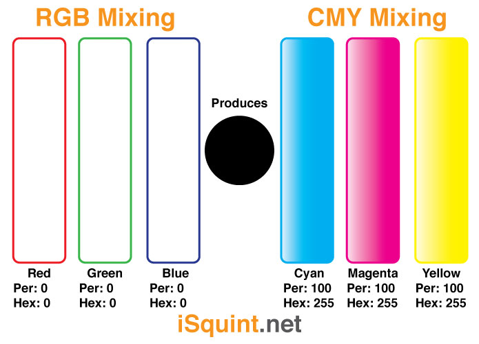
The above illustration shows the complete opposite of white light, no light. With and RGB LED source, that is simple, turn off all the LEDs, or 0% level and the fixture is no putting out any light. With an Tungsten or HMI source, again with CMY flags, if we bring in all of the flags to 100%, none or next to no light will be coming out of the fixture. Of course a simpler and easier way to “black out” a Tungsten source is to take is intensity level to 0%.
The next three illustrations show three colors when mixing between RGB and CMY and how the are almost directly opposite in levels.
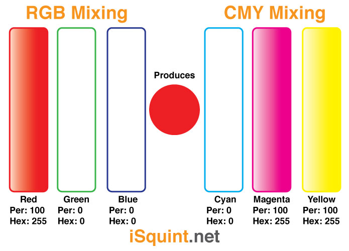
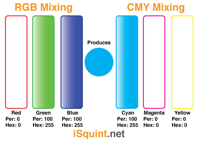
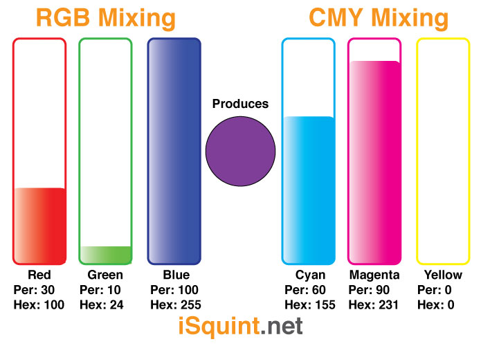
Are these directly opposite all of the time, not necessarily, but they are close. These illustrations show that “theoretically” RGB and CMY modes are directly opposite of each other in levels.
What do you think? IS RGB and CMY truly complete opposites? I would love to hear what you think in the comments section of this article.
Tuesday Twitter Trivia Winner – Color Schemes
Yesterdays Tuesday Twitter Trivia question had to do with color theory and the color wheel. Seemed like yet another easy one right? Not really, but if you remember your color theory from lighting 101, it might not be that difficult. First, yesterdays Tuesday Twitter Trivia question was:
What are the 6 logical combination of colors, or schemes, on a color wheel?
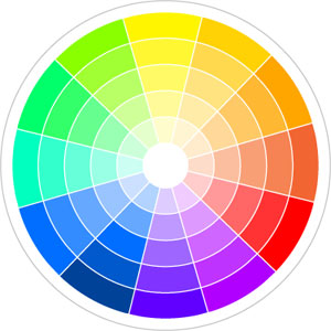
I received a bunch of reply’s with color choices and complementary color, which were incorrect. I was actually looking for the SCHEMES on the color wheel, not the colors themselves. See the image below to help explain the different color schemes that I was looking for.

So did any one win this week? Of course! This weeks Tuesday Twitter Trivia Winner is Brad Peterson or AKA @bradpeterson. Brad had the correct answer in first, so congrats Brad, you win an iSquint Prize Pack! Do you have a lighting trivia question that you think might stump the industry, I would love to hear it. There just might be a prize pack in it for you!
Thanks everyone for playing!
Tuesday Twitter Trivia – Color Schemes
 I had an interesting conversation last night about color and theory with a fellow blogger. The conversation included talk about color and relationships and really got me to thinking about different approaches with in my own designs. I am going to have more about this wonderful conversation later on so stay tuned for that. Now it is on to this weeks Tuesday Twitter Trivia question that is yes, about color.
What are the 6 logical combination of colors, or schemes, on a color wheel?
As with all Tuesday Twitter Trivia questions, please submit your response via Direct Message to @isquint through twitter. The first one with the correct answer this week wins an iSquint prize pack.
Have a Tuesday Twitter Trivia question that might stump everyone? Send me a direct message through twitter or contact me through the contact us page here on iSquint. I just might have a prize pack waiting for you.
Rumor Spreading via Twitter – “Magenta is not a color”
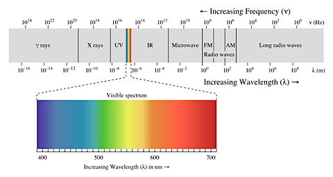
Reading through some twitter feeds today, we saw a tweet about how there is a rumor spreading through twitter that the color magenta is not a color. In an online article on The Neurostimulation Technology Portal by Liz Elliott entitled “Magenta Ain’t A Colour“, Liz claims that the color magenta is not part of the visible color spectrum. This article on Ars Technica’s website by Chris Foresman begs to differ.
Both articles are an interesting read and provide alternative views on why or why not magenta can be considered a color. Have a look at both articles and let us know, Is Magenta a Color?
Thanks fellow tiwtterits!
LatestHeadlines
- Upgrading Your Toolbox: City Theatrical DMXcat-E and DMXcat Multi Function Test Tool
- Claypaky Bringing Back the Sexy to Par Cans with the Midi-B FX
- Ayrton Evolves the Cobra, the Cobra2 Developed for the US Market
- MA Lighting Intros grandMA3 onPC Fader Wing and DIN-Rail Nodes
- Live Events LEVL Up Fest: A Festival to Aid our Industry