SLDC2013: New Resource, An Example “Entry”
It is March 6th, that means there are only 23 days left to work on your entry for the Student Lighting Design Competition! To help students understand what the judges are looking for in an entry, I have decided to put up an example entry of my own to show roughly what is expected.
There is ALWAYS a Catch
Let me start with this… It has been some time… like a LONG time since I have sat down and designed a show from start to finish in Vectorworks. Call me a bar napkin kind of designer. I would like to say I know the software since it is what I learned on in college. But, that was over 10 years ago and things have changed from the version of the software I used. I now know what a new user to Vectorworks goes through. I understood most of it, but found myself reaching for support in guides, calls, and online. I would like call this is a professional plot and section, but it just isn’t. I put many hours into this, but not nearly as many as you or anyone should for this competition. This is a case of, “do as I say and not as I do.” Don’t rush this process. Take your time and present your design in the best light possible (yes, pun intended).
My Support System
To help begin this process, I wanted to experience it from a students perspective. Not too hard when I have a vague understanding of the software! One of the main forms of support I used was the fantastic Vectorworks Spotlight 2013 Getting Started Guide. If you have never worked in the software before, it walks you right through it all. Download it, save it, print it and most of all, USE IT. If I couldn’t find a answer to my question in the guide or the help file, off to Google I went. Vectorworks has a NUMBER of forums, blogs and resources available online. Most times, I found my answer through Google. If I didn’t, my last resort was fellow judge and product manager for Vectorworks, Kevin Linzey. Since students have professors to consult with, I used “my professor!”
Be Kind, Be Gentle
That being said, use this example as a guide for what the judges are looking for in a package and roughly the style and compression of the actual drafting. Don’t mind the stray pencil marks… I was never good at erasing ALL my markings. To further help students understand what the judges are looking for, I am giving you a rare glimpse into what the judges say and go through with each entry of the SLDC. I am opening up myself and my design to the mercy of the judges wrath to illustrate what I did wrong/right and how to prevent yourself from making the same mistake in your entry. Look for an update soon on how to view what the judges have to say about my design.
Entry Structure

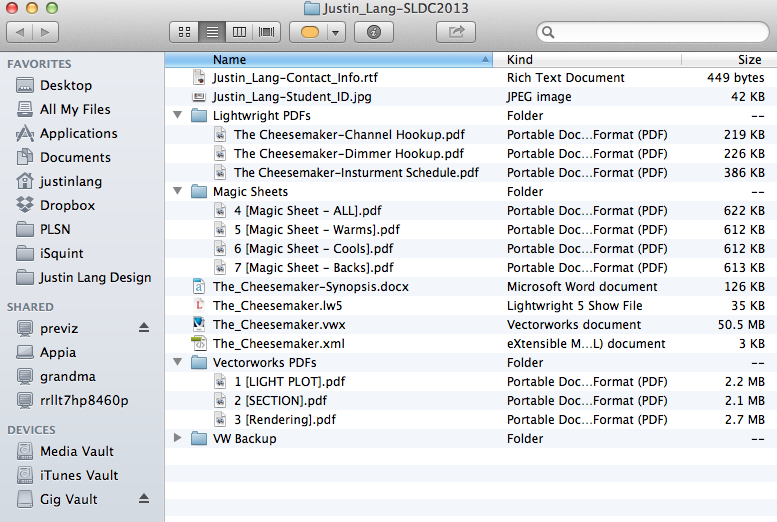
Above is a screen shot of what my example entry contains. These are all of the elements that we are looking for when you are submitting your entry. For an added bonus, I added some magic sheets that I created out of Vectorworks. Not required, but still pretty neat idea that I got from a friend.
Example Entry
Now, for your viewing pleasure, here is my Example Entry to the 2013 SLDC. These files are provided as learning tool and are not to be used for any other purpose. The space is made up with some “hidden” elements along with some of the custom symbols I made and used. We know where these hidden elements are and we will be watching for them. So please, do not reuse someone else work. Be creative and resourceful. While you are at it, have fun with it… I sure did!
Good luck and Break-a-lag!
